Hi, I'm Yevgen Reznichenko

Web UX/UI designer
Enthusiast who creates beautiful 💠, friendly 🧸, and effective 🎯 minimalist interfaces. With 6+ years of experience in online marketing.
Featured works
Services
UX/UI-design
online store, website, landing page
Simple website
landing page, business card, portfolio
Skills
Testimonial

Olga Slynko
Highly recommend Yevgen for simple website development. The site he created for me is affordable, well-structured, and easy to navigate. Yevgen's initiative and professionalism are commendable. Starting entrepreneurs will benefit from his services.

UI/UX enthusiast
Passionate about beautiful and user-friendly minimalist interfaces

UI/UX enthusiast
Passionate about beautiful and user-friendly minimalist interfaces

UI/UX enthusiast
Passionate about beautiful and user-friendly minimalist interfaces

UI/UX enthusiast
Passionate about beautiful and user-friendly minimalist interfaces

UI/UX enthusiast
Passionate about beautiful and user-friendly minimalist interfaces

UI/UX enthusiast
Passionate about beautiful and user-friendly minimalist interfaces

UI/UX enthusiast
Passionate about beautiful and user-friendly minimalist interfaces

UI/UX enthusiast
Passionate about beautiful and user-friendly minimalist interfaces

UI/UX enthusiast
Passionate about beautiful and user-friendly minimalist interfaces

UI/UX enthusiast
Passionate about beautiful and user-friendly minimalist interfaces

UI/UX enthusiast
Passionate about beautiful and user-friendly minimalist interfaces

UI/UX enthusiast
Passionate about beautiful and user-friendly minimalist interfaces

UI/UX enthusiast
Passionate about beautiful and user-friendly minimalist interfaces

UI/UX enthusiast
Passionate about beautiful and user-friendly minimalist interfaces

UI/UX enthusiast
Passionate about beautiful and user-friendly minimalist interfaces

UI/UX enthusiast
Passionate about beautiful and user-friendly minimalist interfaces

UI/UX enthusiast
Passionate about beautiful and user-friendly minimalist interfaces

UI/UX enthusiast
Passionate about beautiful and user-friendly minimalist interfaces

UI/UX enthusiast
Passionate about beautiful and user-friendly minimalist interfaces

UI/UX enthusiast
Passionate about beautiful and user-friendly minimalist interfaces

UI/UX enthusiast
Passionate about beautiful and user-friendly minimalist interfaces

UI/UX enthusiast
Passionate about beautiful and user-friendly minimalist interfaces

UI/UX enthusiast
Passionate about beautiful and user-friendly minimalist interfaces

UI/UX enthusiast
Passionate about beautiful and user-friendly minimalist interfaces

UI/UX enthusiast
Passionate about beautiful and user-friendly minimalist interfaces

UI/UX enthusiast
Passionate about beautiful and user-friendly minimalist interfaces

UI/UX enthusiast
Passionate about beautiful and user-friendly minimalist interfaces

UI/UX enthusiast
Passionate about beautiful and user-friendly minimalist interfaces

UI/UX enthusiast
Passionate about beautiful and user-friendly minimalist interfaces

UI/UX enthusiast
Passionate about beautiful and user-friendly minimalist interfaces

UI/UX enthusiast
Passionate about beautiful and user-friendly minimalist interfaces
🏠 Дизайн інтернет-магазину
Дизайн інтерфейсу та прототип інтернет-магазину з продажу товарів для дому. Розроблений стиль, логіка взаємодії та адаптивність під мобільний і планшет.
Створено
Термін
Інструмент
🏠 Дизайн інтернет-магазину
Дизайн інтерфейсу та прототип інтернет-магазину з продажу товарів для дому. Розроблений стиль, логіка взаємодії та адаптивність під мобільний і планшет.
Створено
Термін
Інструмент
🏠 Дизайн інтернет-магазину
Дизайн інтерфейсу та прототип інтернет-магазину з продажу товарів для дому. Розроблений стиль, логіка взаємодії та адаптивність під мобільний і планшет.
Створено
Термін
Інструмент
All works
Domify
Design and prototype 🏠
Created the UI/UX design for an online store from scratch, including the visual style, interaction logic, and adaptability for mobile and tablet devices.
Design
Details
Created
Term
Tools
Work done
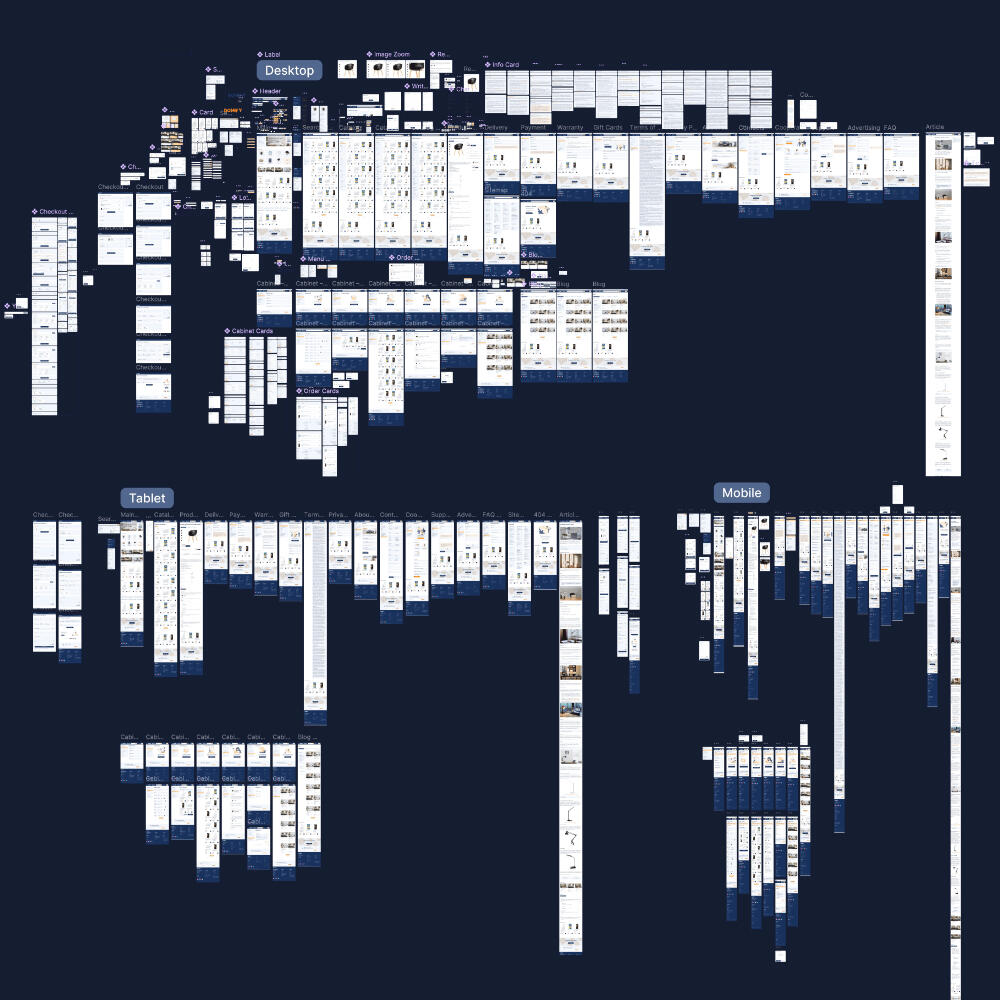
60+ pages for 3 screen sizes
Designed from scratch, with additional pages for complex interactions within checkout and personal account.
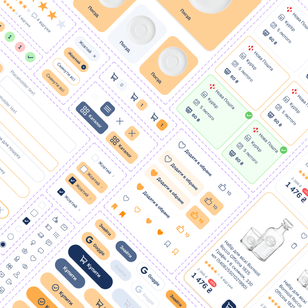
100+ components
For different states (rest, hovering, clicked) of buttons, fields, and cards. Adapted for tablets and mobile devices.
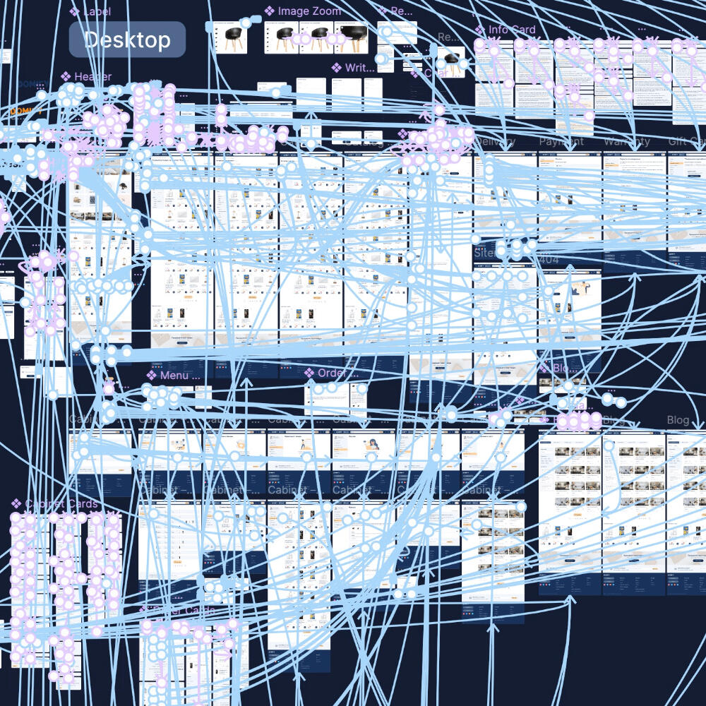
High fidelity prototype
Detailed interactions for the desktop version. With differences for mobile. Try it out 🔗
Backstory 🧩
The input was examples of popular online stores in Ukraine, colors, and a concept with a sense of "magic". Taking into account the minimalist design, I tried to achieve the effect with a bright fill and shadows when hovering over the elements.Taking into account the theme of household goods, I added friendliness with rounded corners and a font for key elements (headings, buttons, etc.).Thank you for reading 🙏
Milira
Landing redesign 🛍️
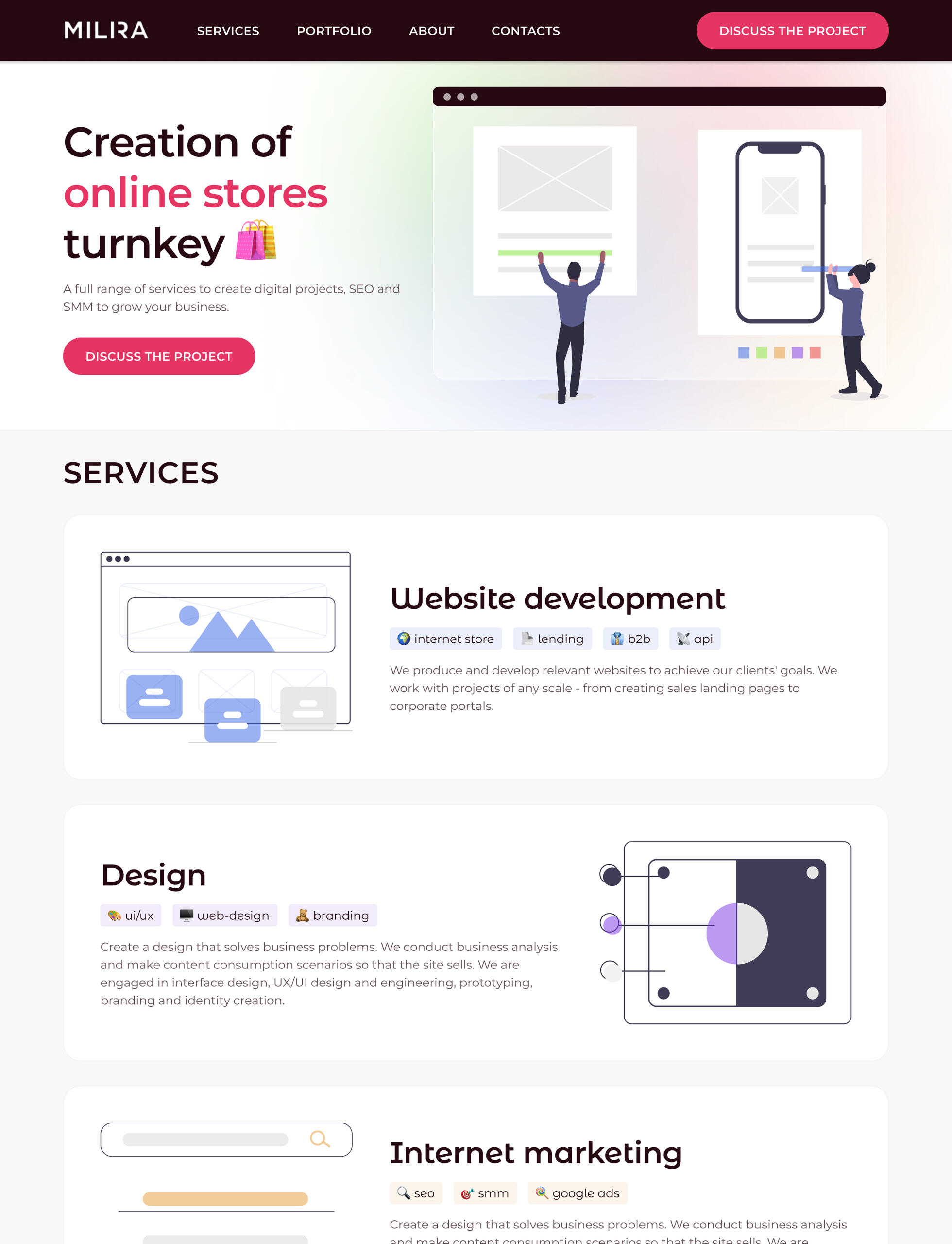
Redesigned the digital agency's landing page by creating the structure of page elements, visual style, and a basic prototype.
Design
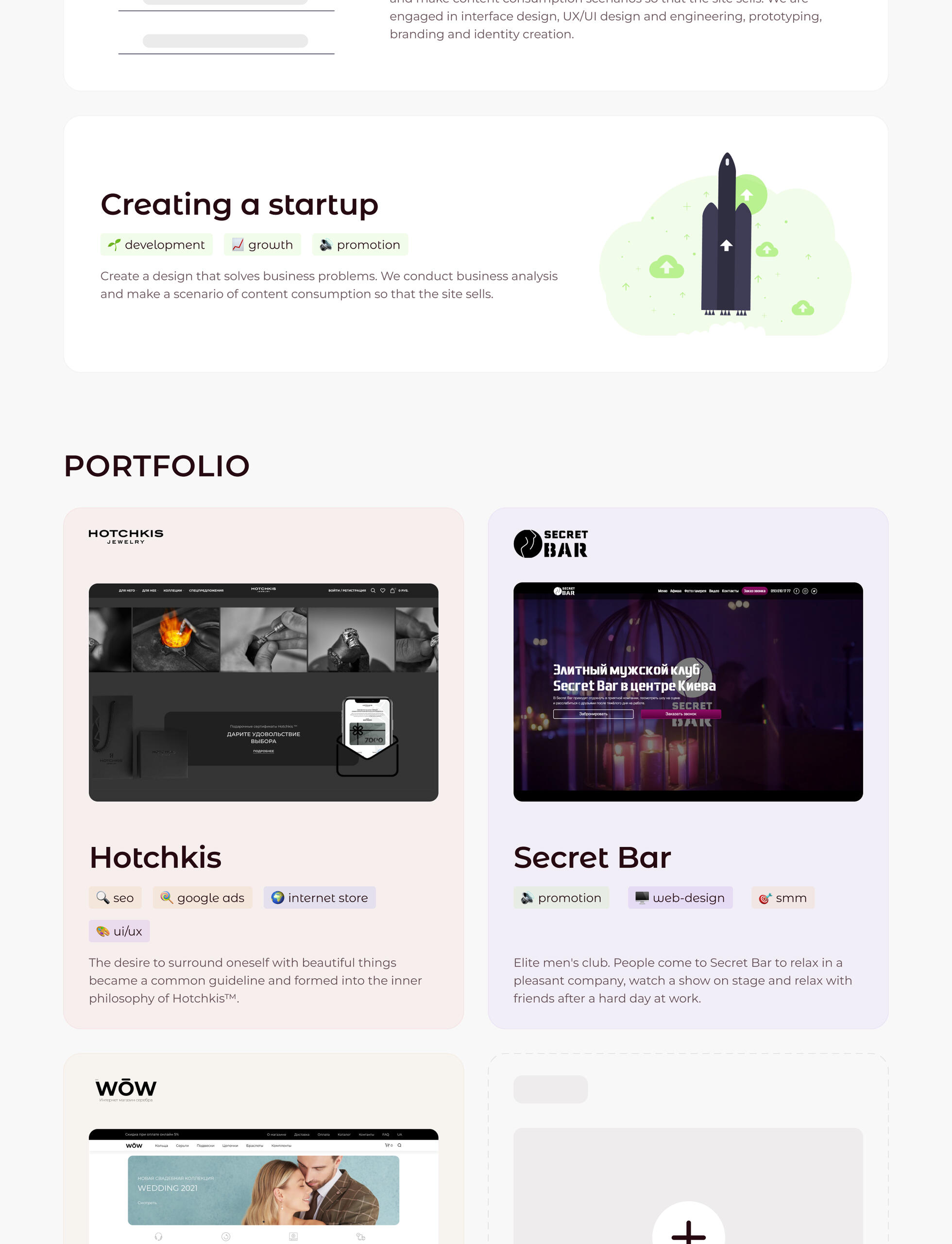
Heuristic Evaluation
Introduction 👐
Overall, the design was good before the redesign. From the good stuff:
The fonts correspond to the modern theme of the site and are well combined with each other;
colors are pleasant, their palette is sufficient to create variety and accents.
However, there were still many details that could be honed.
👉 After redesign
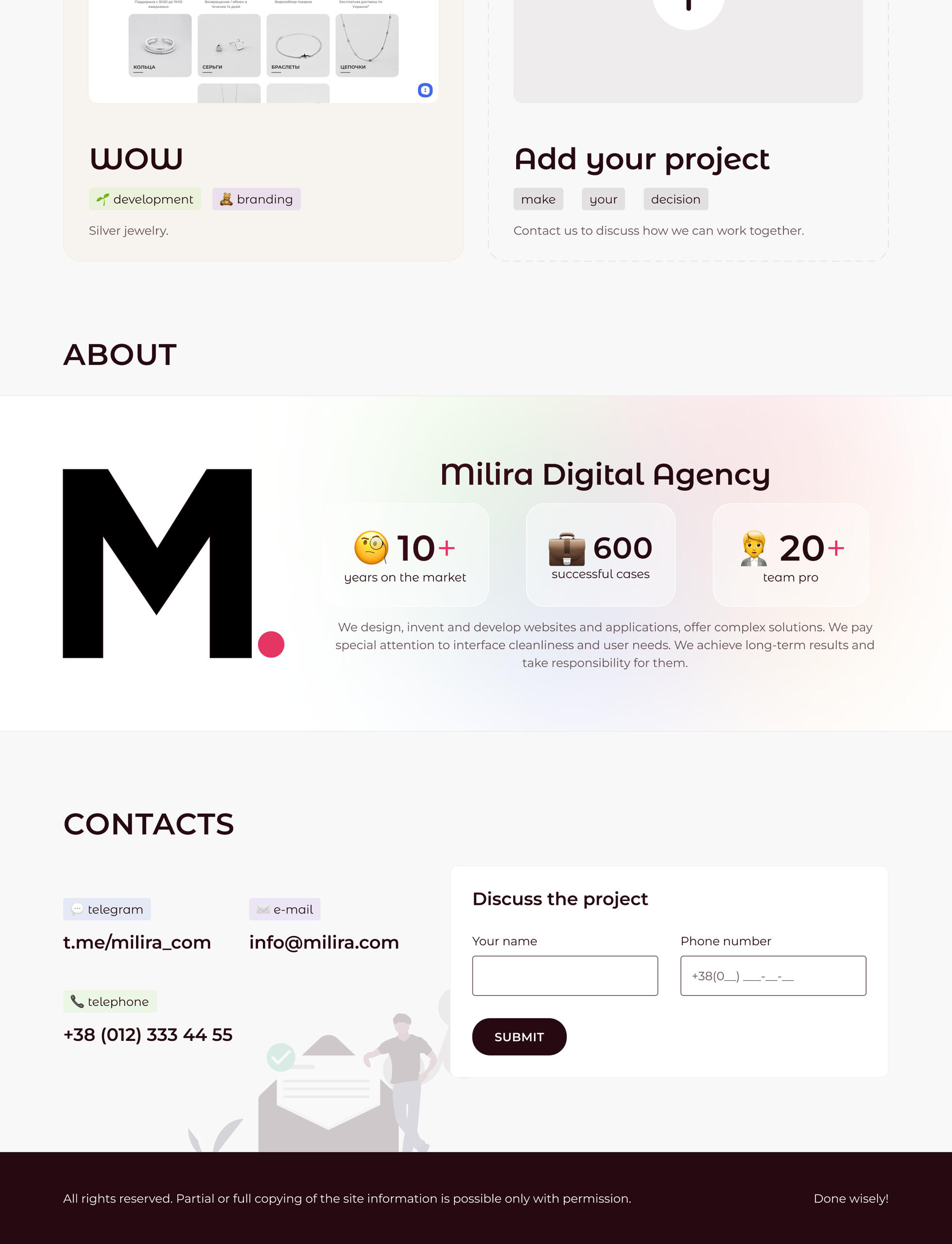
I took the fonts and colors from the version before the redesign. Next, I chose thematic elements - easy and understandable emojis. People use them in everyday life, so their use reduces the load on cognitive properties.By weaving them throughout the site, I managed to achieve a similarity.
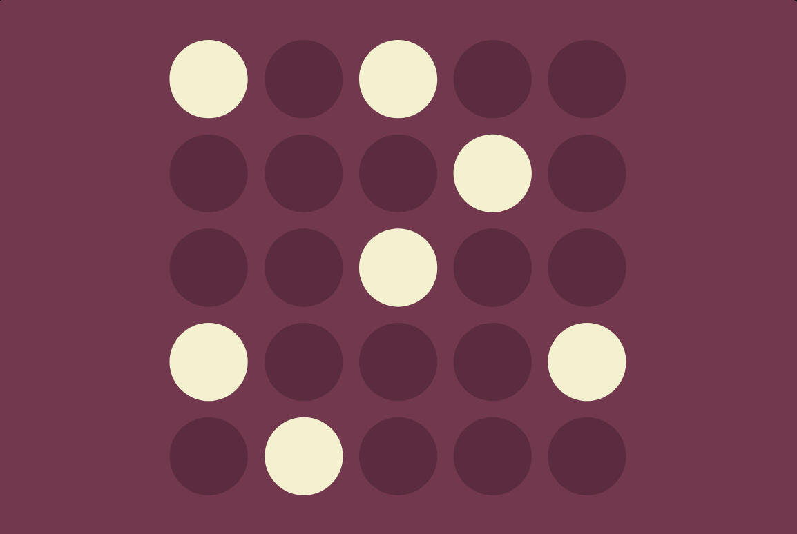
Law of Similarity
The human eye tends to perceive similar elements in a design as a complete picture, shape, or group, even if those elements are separated.
Navigation 🧭
👈 Before redesign
It was impossible to use the navigation after the first scroll because navigation was hidden. It's better to give the ability to go to other sections or fill out an application at any time. Wherever the user is on the page.

👉 After redesign
That's why I provided a floating menu.

Try scrolling in the prototype 🔗
Hero image 🦸
👈 Before redesign
The photo was difficult to interpret at a glance. It shows people rejoicing over parcels from an online store. Next to it, there are complicated, loaded diagrams that need to be deciphered.
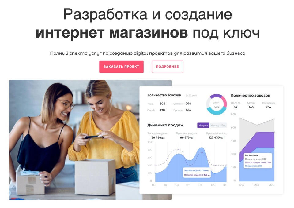
It is possible to respond to the subject of the site more clearly and with less effort for the user. And take into account the Law of Prägnanz.

Law of Prägnanz
People will perceive and interpret ambiguous or complex images as the simplest form possible, because it is the interpretation that requires the least cognitive effort of us.
👉 After redesign
I emphasized the headline with the main color and reduced the emphasis of the secondary text.
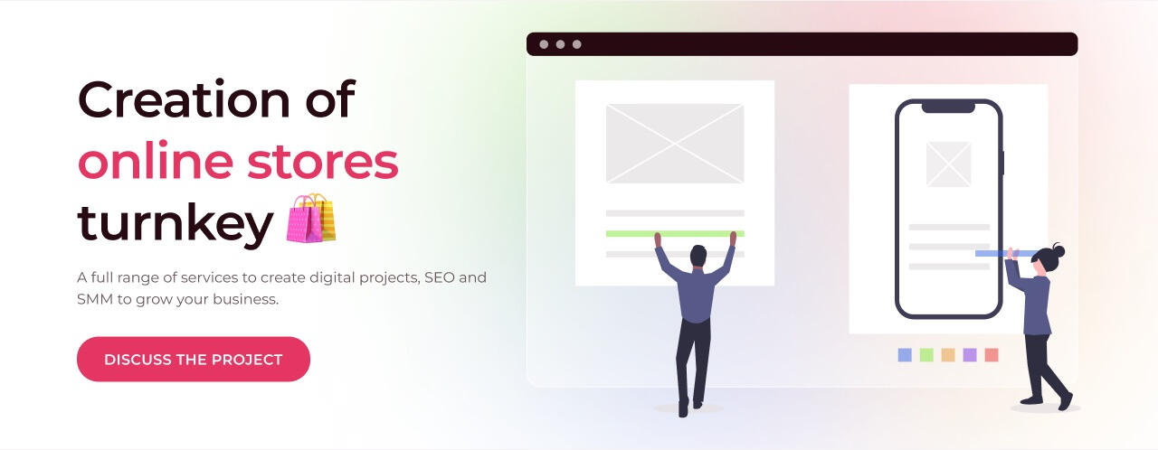
To place the elements, I used one of the classical schemes that visitors are already familiar with from other sites.

Jakob’s Law
Users spend most of their time on other sites. This means that users prefer your site to work the same way as all the other sites they already know.
Services ⏳
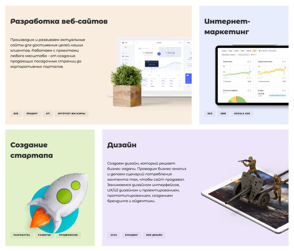
👈 Before redesign
These illustrations will be easier to perceive if they are consistent. Now it's screenshots on devices, a real object, and augmented reality. In different styles, sizes, and locations.
👉 After redesign
I adjusted the color saturation for the illustrations and the brightness for the labels with the list of services.
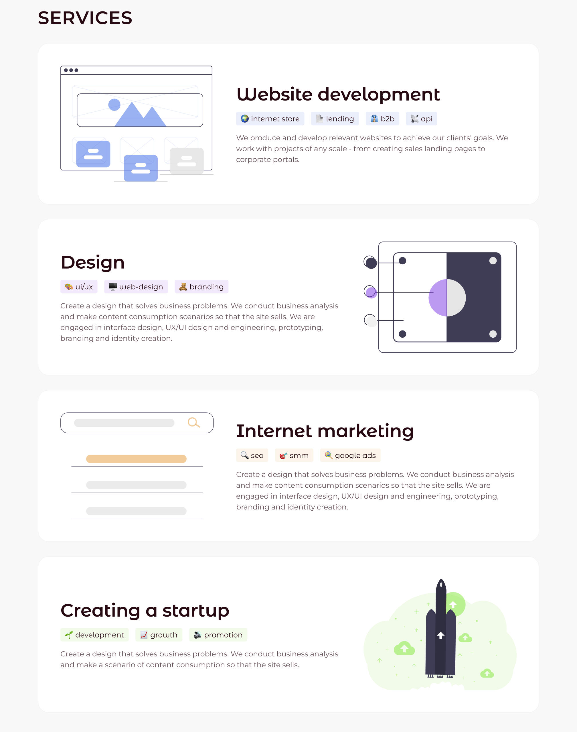
I took the illustrations from unDraw. They are in the same style throughout the site and, together with emojis, reinforce the effect of similarity. This allows users to focus on their tasks rather than learning new models.
Portfolio 💼
👈 Before redesign
Illustrations of projects may be more appropriate. Instead of items that characterize the activities of client sites, you can post screenshots of the agency's work.

👉 After redesign
Instead of using new colors for the background, I reduced the opacity of the existing ones and used them.
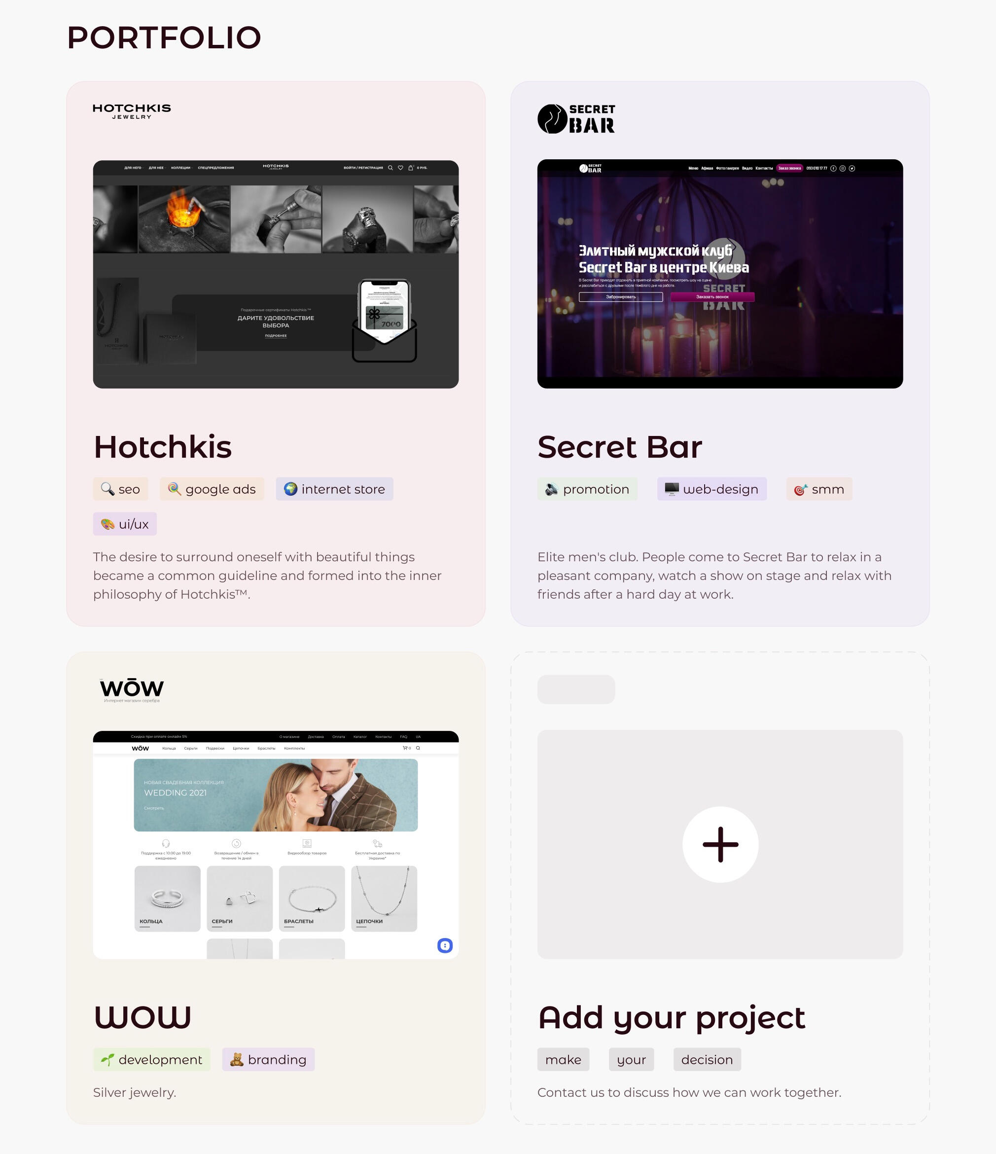
I made screenshots the most important part of the cards. When you hover over them, the color changes slightly and the size of the screenshot increases. Try pointing and clicking on them in the prototype 🔗 from your computer.I also added labels to the cards to indicate the work performed. I transferred the labels in the same layout and colors as in the block with services. Another small, consistent detail to reduce the cognitive load on the user.
About the company 💬
👈 Before redesign
In this block, it was possible to work with accents. Also, use the space more rationally.

For example, the letter “M” is almost not visible. And the play button with the inscription breaks up the information about the agency, while there is empty space under the letter “M”.
👉 After redesign
I have emphasized the logo and key information.
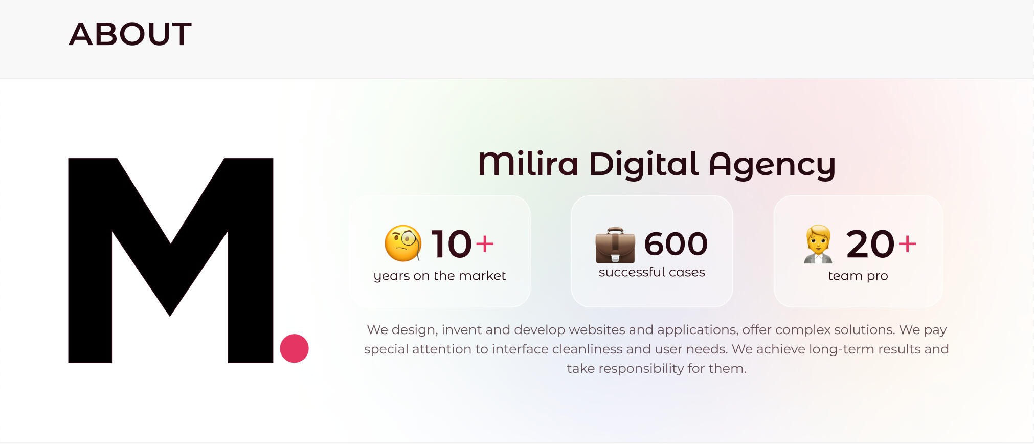
To make them memorable.
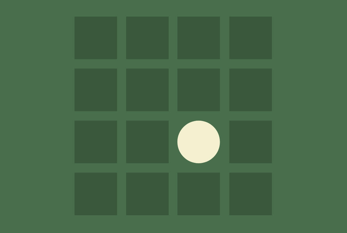
The Isolation Effect
The Isolation Effect, predicts that when multiple similar objects are present, the one that differs from the rest is most likely to be remembered.
Contacts 📇
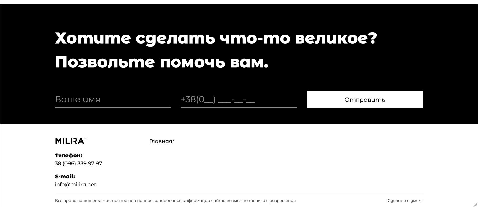
👈 Before redesign
And finally, it would be nice to do something about accents in contacts.
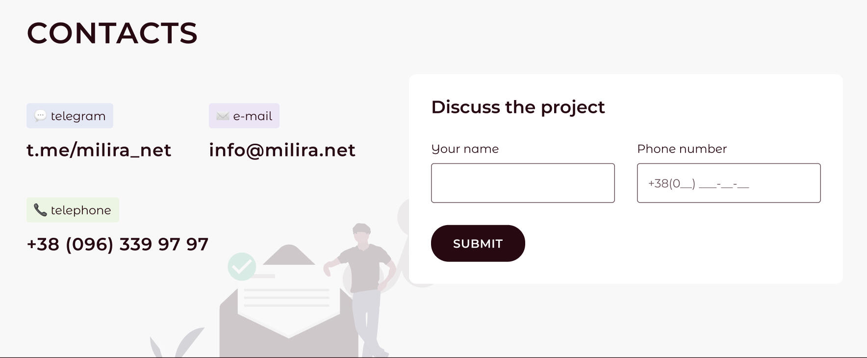
👉 After redesign
In them, I used common elements for the site - emojis and illustrations. It turned out like this.
Conclusion 🎬
As a result, the layout of the elements, visual style, accents, and hover + click animations were developed. All contrasts were tested for accessibility.All this is necessary to achieve the aesthetic-usability effect.

Aesthetic-Usability Effect
Users often perceive aesthetically pleasing design as design that’s more usable.
Thank you for reading 🙏
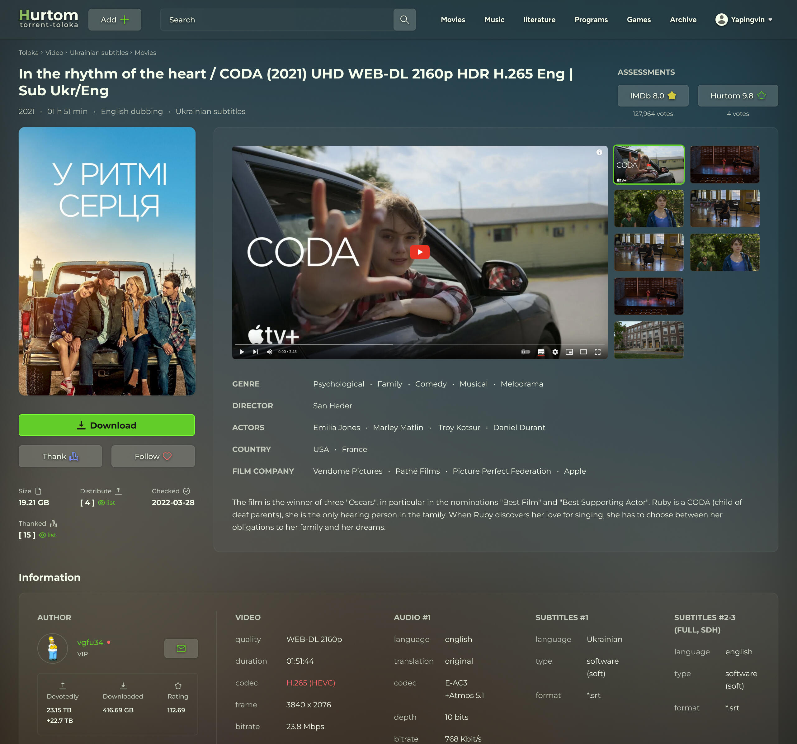
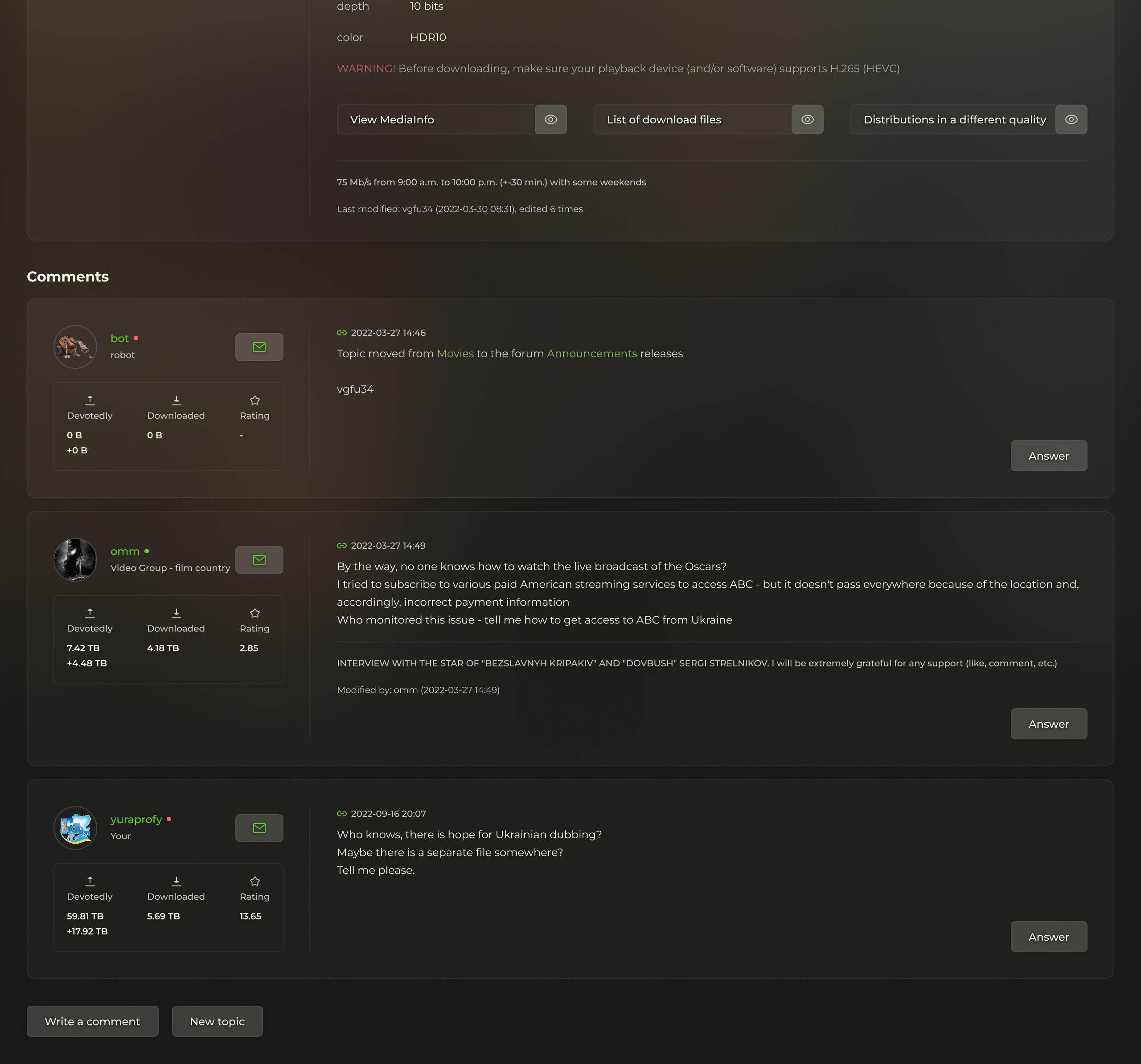
Toloka
Page redesign 🍿
Revamped torrent movie download page design with a modern and sleek appearance.
Design
Airy
Mid-Fidelity wireframe📱
Design and prototype of a mobile app for purchasing smartphones, including a primary set of features.
Wireframe
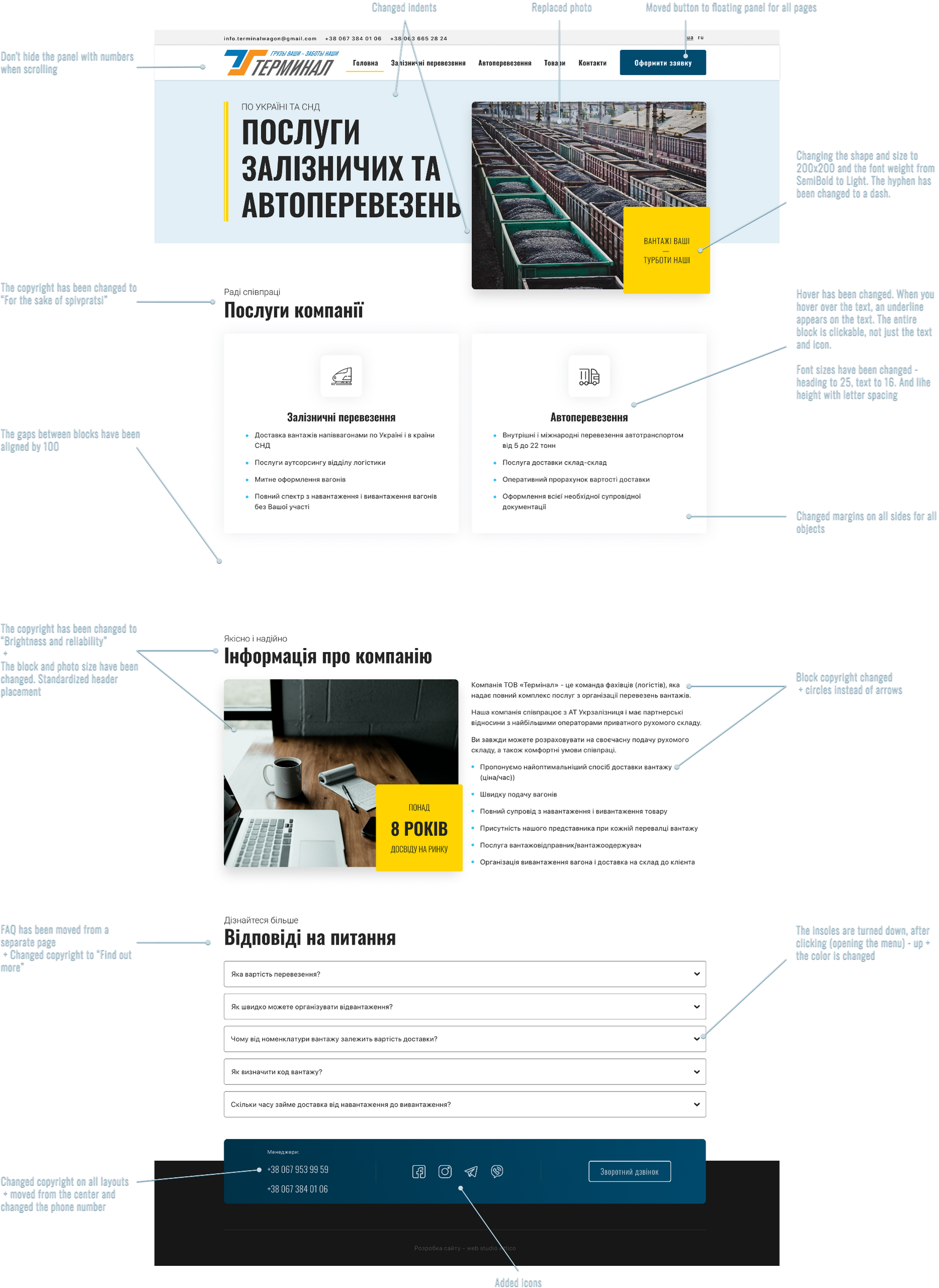
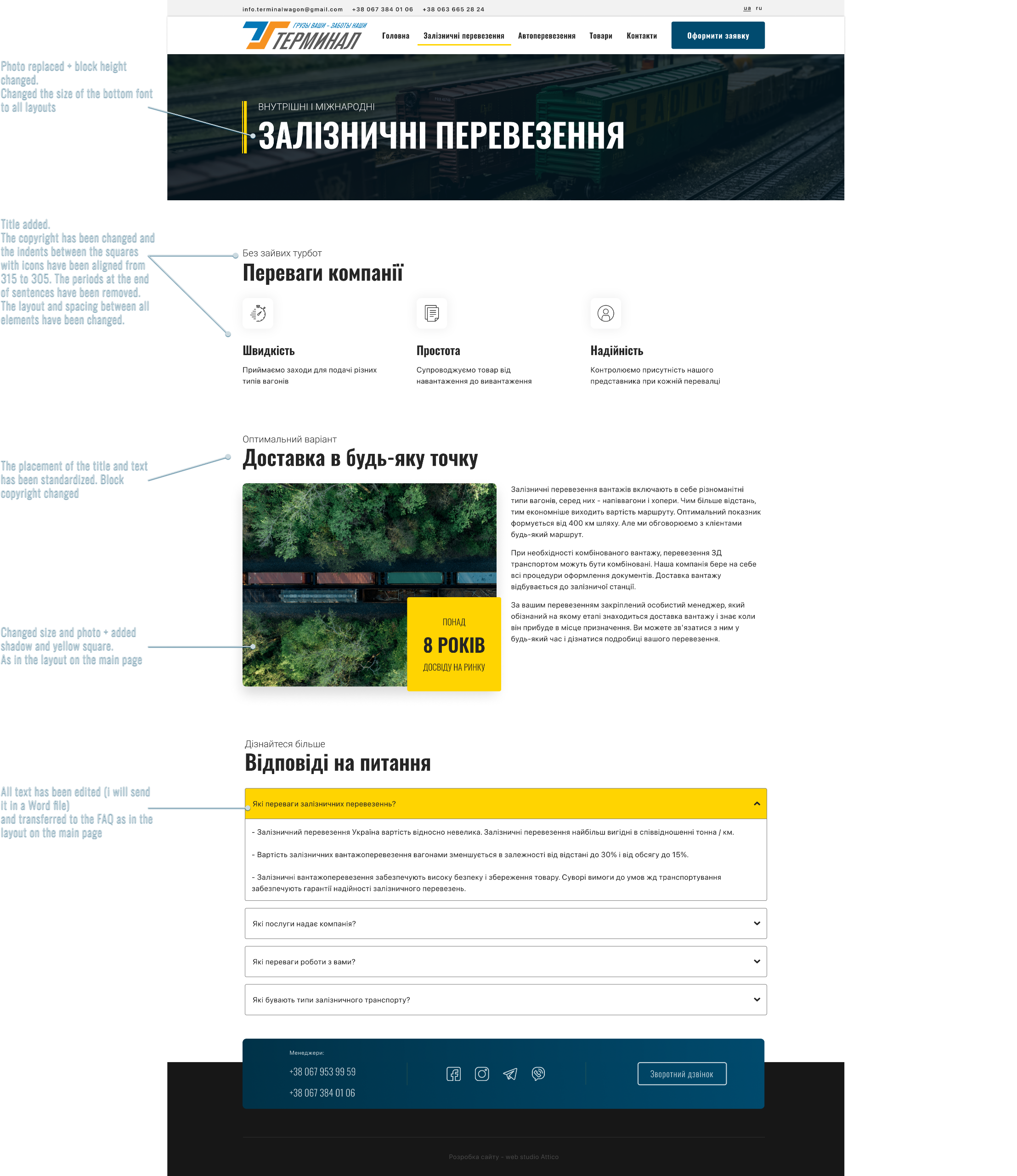
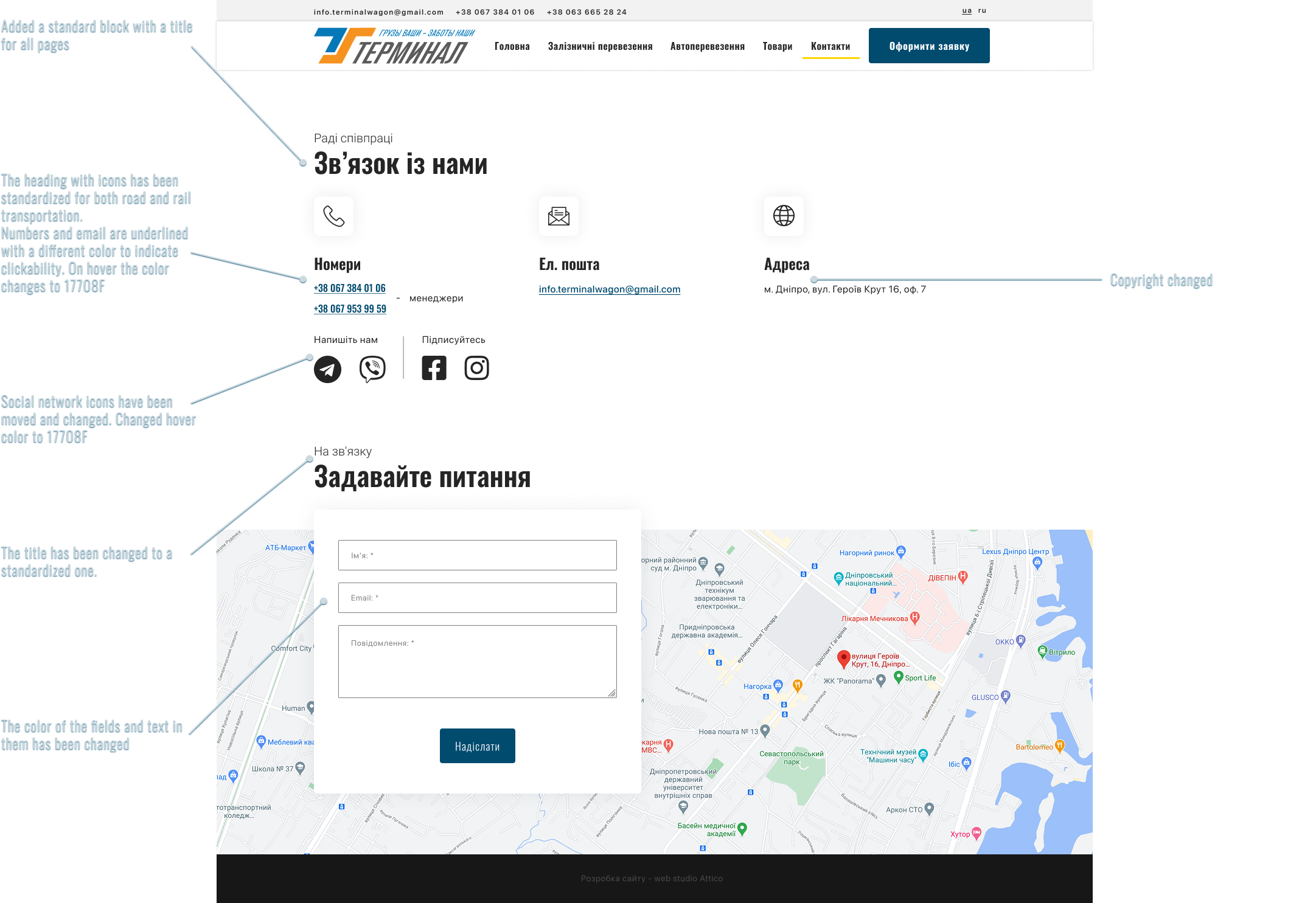
Terminal
Design refinement 🛤️
Enhancement of the cargo transporter's website design. Improved desktop and mobile layouts, with a description for developers.
Refinement
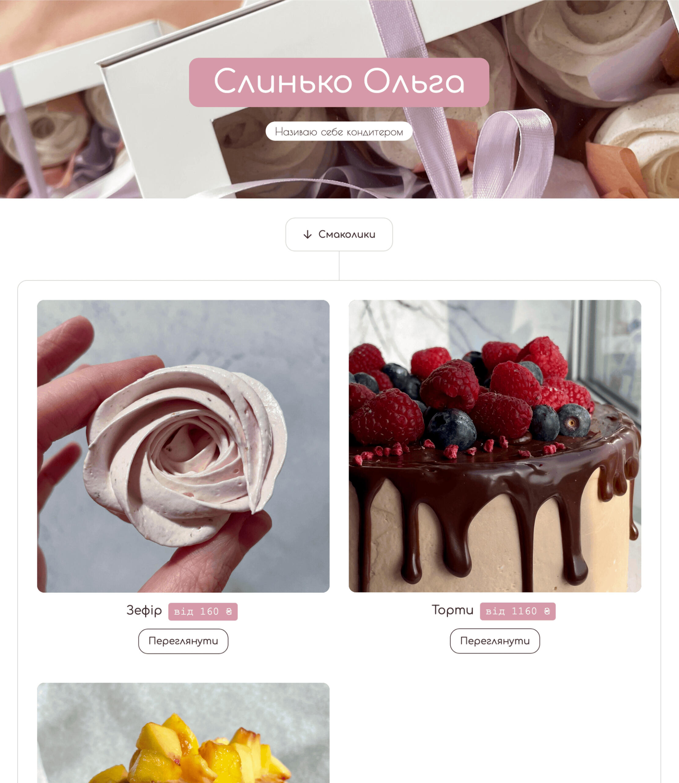
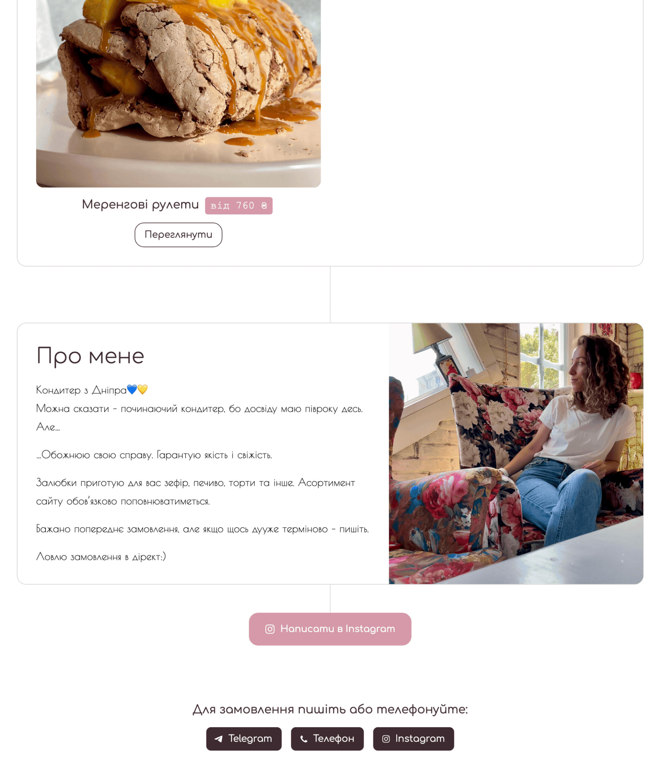
Slynko
Website Creation 🟣
Created a business card website with a structure that displays individual product cards.
Design
Testimonial

Olga Slynko
Confectioner
I really liked the website that Yevgen made for me. First of all, the development of the site and the site itself have an affordable price. This is important for the entrepreneur who is just starting their business.Secondly, the structure of the site is clear, without unnecessary elements, and simple but tasteful. Any visitor to the site can easily navigate its sections, get comprehensive information, and, if interested, contact me.I would also like to recognize Yevgen's initiative and professionalism. Many decisions are his ideas, which he substantiated and explained why it was worth doing so.If you are starting your own business and are thinking about creating a website, I recommend working with Yevgen. It is affordable and professional.
ProfiStore
Landing Design 🧰
Created a landing page design to direct users to different product categories on two websites.
Design
Zir
Competitive analysis 🧿
Study of the implementation of reviews about doctors on similar sites to determine the optimal filling.


